How to Create a Responsive Table in WordPress by Adding Scrollbar
In today’s digital age, ensuring that your website is accessible and user-friendly across various devices is crucial. One common challenge web developers face is making tables responsive, especially when dealing with a large number of columns. In this article, we’ll guide you through creating a responsive table in WordPress using the HTML widget in your page builder.


Step 1: Open Your WordPress Page Builder
Navigate to the page or post where you want to insert the responsive table. Open your WordPress page builder; this could be Gutenberg, Elementor, Divi, or any other page builder you prefer.
Step 2: Add an HTML Widget
Locate the HTML widget in your page builder and add it to the desired section of your page.
Step 3: Insert the Provided Code
Copy and paste the following code into the HTML widget:
<div style="overflow-x:auto;">
  <table>
    <tr>
      <th>First Name</th>
      <th>Last Name</th>
      <th>Points</th>
      <th>Points</th>
      <th>Points</th>
      <th>Points</th>
      <th>Points</th>
      <th>Points</th>
      <th>Points</th>
      <th>Points</th>
      <th>Points</th>
      <th>Points</th>
    </tr>
    <tr>
      <td>Jill</td>
      <td>Smith</td>
      <td>50</td>
      <td>50</td>
      <td>50</td>
      <td>50</td>
      <td>50</td>
      <td>50</td>
      <td>50</td>
      <td>50</td>
      <td>50</td>
      <td>50</td>
    </tr>
    <tr>
      <td>Eve</td>
      <td>Jackson</td>
      <td>94</td>
      <td>94</td>
      <td>94</td>
      <td>94</td>
      <td>94</td>
      <td>94</td>
      <td>94</td>
      <td>94</td>
      <td>94</td>
      <td>94</td>
    </tr>
    <tr>
      <td>Adam</td>
      <td>Johnson</td>
      <td>67</td>
      <td>67</td>
      <td>67</td>
      <td>67</td>
      <td>67</td>
      <td>67</td>
      <td>67</td>
      <td>67</td>
      <td>67</td>
      <td>67</td>
    </tr>
  </table>
</div>
Step 4: Save and Preview
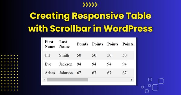
Save your changes and preview the page to see the responsive table in action. The <div> element with the style="overflow-x:auto;" property ensures that a horizontal scrollbar appears when the table overflows its container, making it scrollable and responsive on smaller screens.
If you require professional assistance in resolving website issues or seeking ongoing website maintenance services, feel free to reach out to me (Kashif Mahmood). I am available to discuss how I can best meet your needs and contribute to the optimal performance of your website.
Conclusion
By following these simple steps, you can create a responsive table in WordPress using the HTML widget in your chosen page builder. This approach ensures that your table remains accessible and readable on various devices, even when dealing with a large number of columns. Keep in mind that responsiveness is key to providing a positive user experience, and implementing such techniques contributes to the overall usability of your WordPress site.